
The first constraint was not visual style. It was time.
The first version of Vincent was not planned as a feature race. It started with a blank sheet, a local file, and a small set of actions that had to remain visible without taking attention away from the mark being made. The early rule was direct: if a control needed a panel, the panel had to earn its place.
That made the solution feel closer to a notebook on the desk than a large workspace. Every release kept returning to the same baseline: open a sheet, write a note, mark a screenshot, block a simple shape, crop the result, and export without setting up a project file first.
The goal sounds small until the details are counted. A paper-and-pen app has to respond before the user has finished deciding what the mark means. It has to open an existing image without changing its proportions, keep the current sheet obvious, accept mouse, trackpad, or tablet input, and then save the result through an ordinary file workflow. If any of those steps become project management, the app stops feeling like paper and starts feeling like administration.
That difference shaped the whole build. Vincent was treated as a local application first: no account, no remote workspace, no upload step, and no expectation that a simple mark should become a cloud document. The solution had to feel like something that could sit next to Finder, Preview, a notes app, or a browser window. It needed to be available when the user had a meeting note, an equation, a schedule plan, a screenshot to mark, a personal note beside an image, or a visual thought that would disappear if setup took too long.
A lot of the design work was therefore subtractive. I kept asking what could be removed without making the app weaker. A command could be visible if it helped the next action. A panel could open if it gave the active action necessary precision. A decorative surface or long onboarding flow did not pass that test. The interface had to spend its complexity on the page rather than on explaining itself.
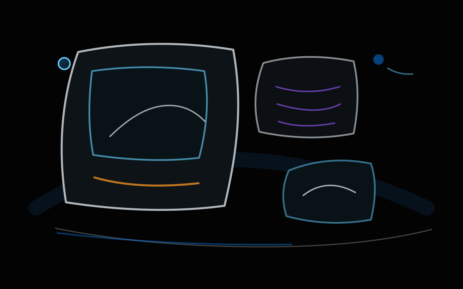
The notebook sketch above represents that early solution shape better than a polished mockup would. The important part was not the exact placement of every control. It was the relationship between the sheet and the surrounding tools: the work had to remain the largest object on the page, and the controls had to remain close enough that the user could change direction without context switching.
The visible tools were treated like a pencil case.
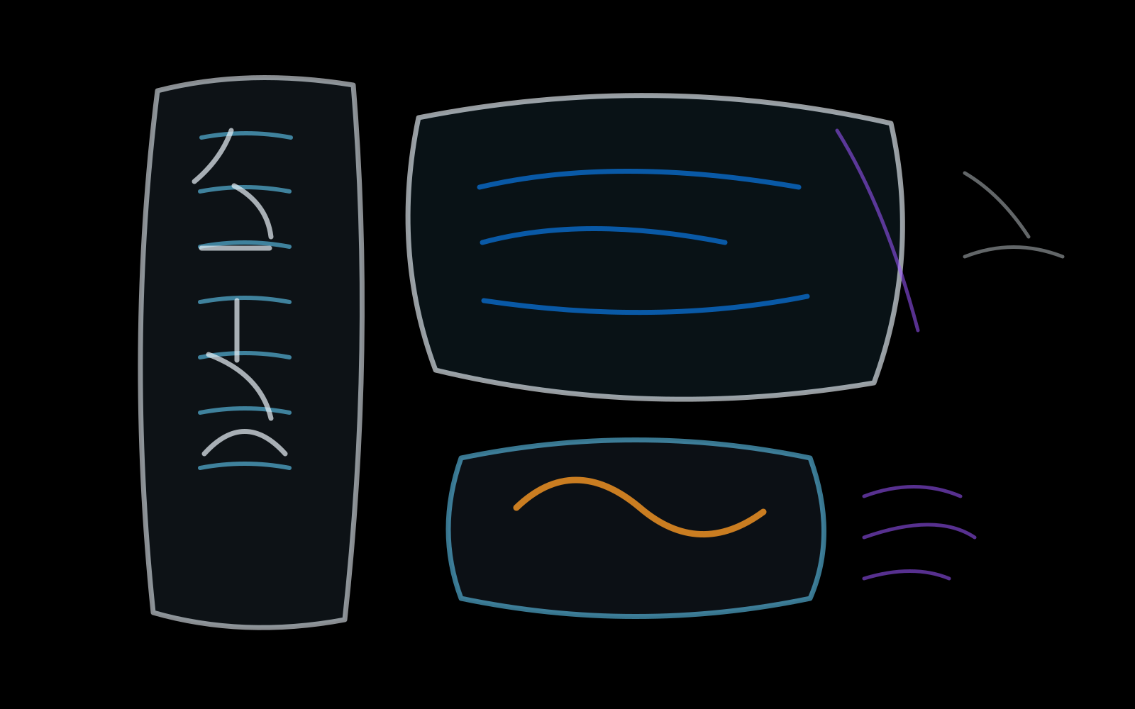
The visible actions were arranged so the workflow could be read like the contents of a small pencil case. Vincent does not hide every command, but it avoids turning the tool area into a control room.
I wanted the toolbar to carry the grammar of ordinary paper work. Start by making a mark, correct it, choose an area, add language, then place a clean shape when freehand freehand marks are not the clearest answer. That is why the toolbar is compact but not empty. It is allowed to show enough tools to be legible, as long as those tools do not begin competing with the sheet.
This was one of the places where Vincent had to be more capable without becoming louder. A paper pad is fast because it is obvious, but it becomes frustrating once the user needs a cleaner shape, a text note, a separate sheet, or a predictable pen. Vincent tries to solve the common part of the problem while keeping the first screen readable.
The shape menu is a good example. It does not attempt to become a vector design environment. It simply provides rectangles, ellipses, triangles, diamonds, stars, and speech bubbles because those are the marks people reach for when explaining a screenshot, blocking a layout, or turning a rough note into something another person can understand. The tool is practical because it treats shapes as everyday marks, not as a separate design discipline.
The same rule applied to text. Text in Vincent is not meant to replace a publishing system. It is there because many quick sheets become useful only after a label, comment, or short instruction is placed near the mark. The interface needed to make that possible without asking the user to switch applications just to add a sentence.
State stayed visible because paper should feel trustworthy.
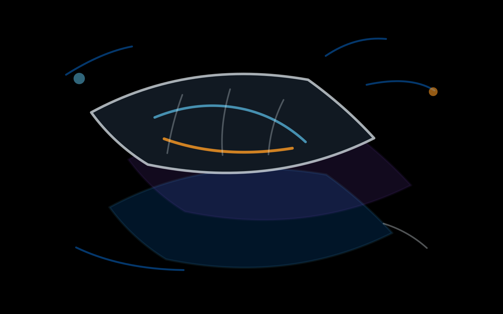
The document state stayed close to the sheet instead of becoming a separate management system. A quick paper-and-pen app can still support layered work, but the user should always know what is active and what is background.
The decision to keep state visible came from a simple frustration: in a fast tool, hidden state is expensive. If a mark lands on the wrong target, the user should be able to understand why immediately. The visible sheet structure is not only a feature list item; it is a live explanation of where the next mark will go.
Vincent's layer behavior was designed around ordinary desktop paper work rather than a large compositing workflow. A user might keep a background image untouched, draw a correction on top, add a label, and then export a flattened result. That kind of work does not need a deep document browser, but it does need enough separation that a rough mark can be changed without damaging the image underneath.
That also affected the open-image behavior. Opening an image as the first raster should make the canvas match the image, not place the image inside an arbitrary workspace with unwanted margins. For digital paper, the file is often the starting sheet. Preserving that expectation makes imported screenshots, references, and illustrations feel like real working material instead of objects dropped onto a random board.
Undo had to respect the same idea. A user should be able to test a stroke, remove it, try again, and keep moving. The layer and undo systems therefore had to feel connected: the visible state in the list, the pixels on the canvas, and the action history all had to describe the same document.
The engine work stayed hidden behind the feeling of a pen.
The mark path had to feel immediate first. Spacing, flow, opacity, pressure, and undo all became part of the same question: can a rough stroke be made, corrected, and exported before the idea fades?
Pen feel is easy to underestimate because the interface can make it look simple. In practice, the feel of a stroke is a chain of small decisions. How quickly should input be reflected? How much correction should happen before the line stops feeling like the user's hand? Vincent can be internally precise, but that precision should not make the user feel as if they have entered a technical dashboard.
The controls grew from that pressure, not from a desire to look advanced. A casual note, a screenshot mark, and a rough sketch need different kinds of lines, but those choices have to stay near the hand. The user should feel a better pen, not a larger program.
Pressure control mattered for a different reason: Vincent is a desktop app, and desktop mark-making often moves between mouse, trackpad, and tablet. The app could not assume one input style. A mouse user still needs predictable marks. A tablet user needs pressure to feel useful without making the result fragile. The visible experience has to stay simple even when the implementation underneath is careful.
The engine work also had to keep the app responsive while still producing real pixels. A stroke should appear while it is being drawn, then commit cleanly into the document state. That boundary between live feedback and committed raster data is one of the invisible parts of the application. When it works, the user never thinks about it. When it is wrong, the whole app feels slow, even if the interface looks minimal.
Shipping meant making the small tool feel ready for daily use.
The final pass was packaging, icon work, screenshots, and solution copy. Vincent needed to look like a small app on purpose, not like an unfinished slice of a larger system.
This part of the work changed the project from an internal tool into a solution. A small desktop app still has to answer solution questions clearly: what is the current version, what platform is available, what happens after adding Vincent for free, where does the download come from, and what does the app do with the user's files? If those answers are vague, the simplicity of the application starts to look like incompleteness.
The solution page therefore had to be more explicit than the app itself. Vincent can be quiet in use because the sheet is where the work happens. The website has a different job: it has to explain that the app is cross-platform local digital paper and pen, that platform-specific delivery details are shown clearly, and that account-linked free access can be reused for download access regardless of version. Those details are not decorative copy. They reduce uncertainty before someone installs the app.
The icon work had a similar role. Vincent's icon needed to feel like an installed app, not merely a logo placed on a web page. The rounded treatment on the solution page, the installer language, and the download route all support the same message: this is a desktop paper-and-pen tool that belongs in the user's local workflow.
The release package also forced a useful discipline. It made every claim testable. If the page says the app opens images, the app has to open images in a way that respects the original canvas. If the page says the workflow is local, the download and privacy language have to say the same thing. If the page says the app is quick, the first interaction after launch has to support that claim.

The solution is still intentionally narrow.
Vincent is not trying to replace a professional image suite. The goal is smaller and more practical: make digital paper that opens quickly, accepts a rough visual thought, and gets out of the way before the work becomes administration.
That narrowness is not a temporary limitation to hide. It is the shape of the solution. A lot of software expands until every task is possible but no task feels light. Vincent moves in the other direction. It tries to make common visual jobs feel like ordinary paper work: mark this image, sketch this layout, label this screenshot, block this shape, clean this rough asset, and export the result.
The app will keep growing, but the constraint remains useful. New controls have to make the first page faster or clearer. New formats have to respect the existing local file workflow. New platform work has to keep the desktop feeling direct. If a feature makes Vincent look more impressive while making the first mark slower, it does not belong in the main path.
That is the central lesson of building Vincent so far: digital paper and pen does not need to become a large suite to be serious. It becomes serious when the small tasks are treated with enough care that users can trust them every day.